BridgeU
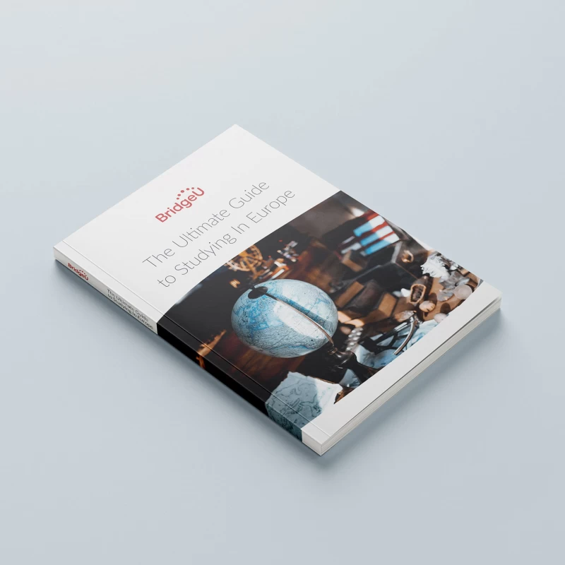
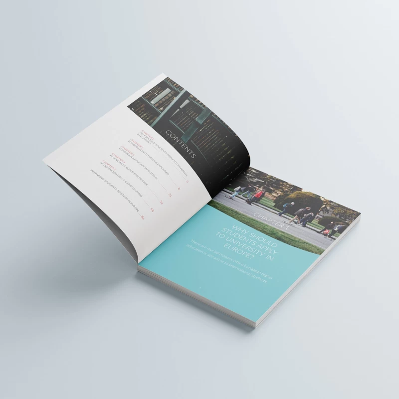
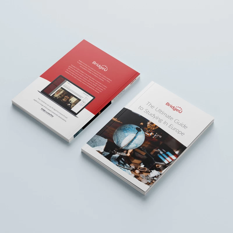
BridgeU is a London-based educational consulting company providing university and career guidance to students from all over the world. I got an opportunity to design a handy compact Guide To Study In Europe for them.
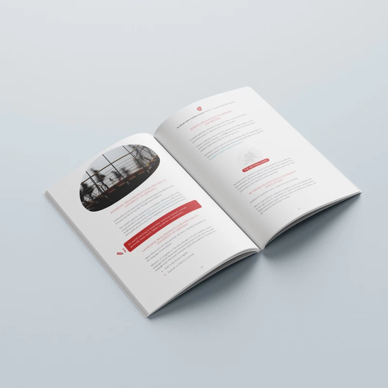
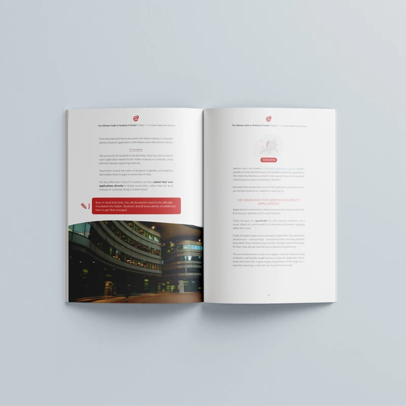
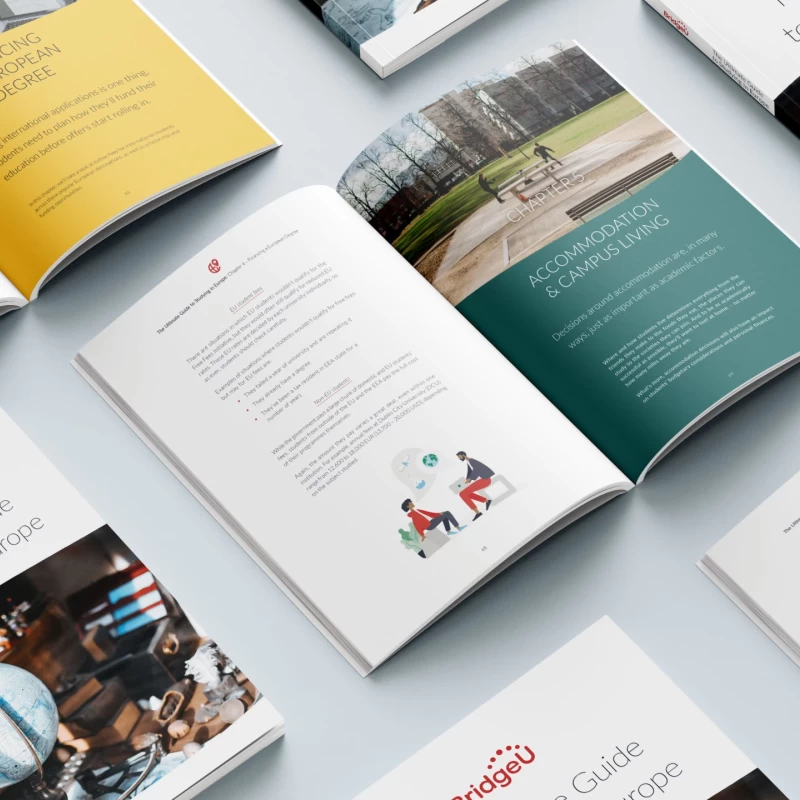
To define the publication appearance I used a combination of bespoke illustrations provided by the client, free stock photography, and a system of icons that highlight a country shape in every section that talks about that country. Since most of the guide contents is of administrative nature I came up with an efficient typographic hierarchy comprising subsections, callouts, and sets of nested lists that allowed readers to promptly navigate through multiple options and quickly find information that relates to them.
2022
